


Mapping the Airport Experience
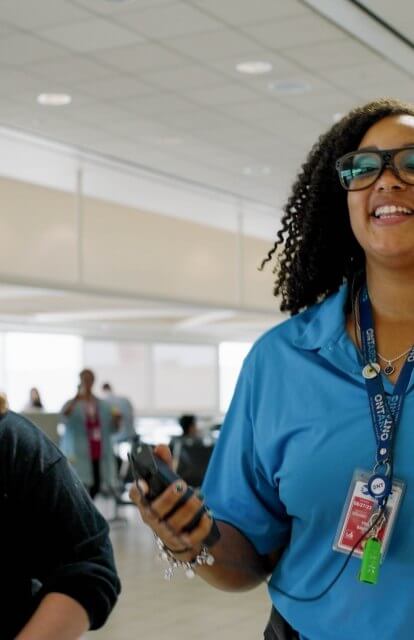
Samantha Flores, director of Corgan’s research and innovation group Hugo, presented the group’s passenger journey mapping study from Ontario International Airport (ONT) at the 2024 Passenger Terminal Expo Conference in Frankfurt, Germany. PTE is a yearly conference focused on innovations in aviation.
Human experience in aviation
Imagine you are at an airport you’ve never been to before, catching a connecting flight. Or, imagine you are a new mom navigating a familiar airport with a stroller for the first time. You might feel anxious, tired, hungry, or otherwise out of sorts. What might make your trip smoother and more enjoyable? What might make it worse? These questions are not hypothetical – as researchers, we often hear questions from design teams about how they can design for the user experience: How can we design to lower stress and increase mood? How can design increase revenue or influence navigation?
What these questions really mean is: How can elevating the user experience through design impact business outcomes for our clients? To answer that question, we have to step into the shoes of the wide range of people who use airports. Developing a customer journey map is a great way to meet those experiential design objectives while also prioritizing the investment goals for your client's business. We used this strategy in the Ontario International Airport Authority (ONT)’s Experiential Objectives Analysis (EOA). The airport was looking to define the customer’s experience and identify gaps in service or amenities to help inform their development plan.
Stepping into their shoes
Creating strategies to improve the passenger and employee experience started with collecting data around pain points. Our team collected data at the site through three phases:
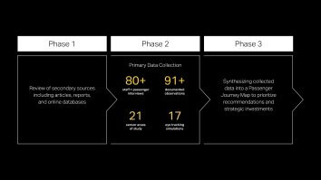
Our team also gauged the experience at each touch point to evaluate and prioritize short-term and long-term changes:
- We looked at necessary changes and solutions that can happen quickly, at very little extra cost and with very few resources.
- We looked for more ideal solutions that can happen over time with more investment to provide better operational performance.
- We explored whole building solutions for potential future development to achieve the desired user experience.
No passenger left behind
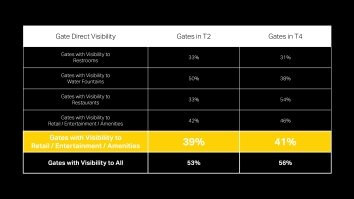
If you think about your typical airport experience, there is probably one concern that outweighs all others: missing your flight. One major pain point in our research revolved around the conflict between passengers’ desire to be at the boarding gate with plenty of time before their departure and a lack of information to help passengers make decisions about dining and other amenities. Both passenger feedback and our eye tracking simulations confirmed that passengers want to visit their gate before identifying additional resources and amenities to use before their flight. So, we conducted a visibility analysis to understand what is visible to passengers from the gate lounge, looking specifically at direct visibility and disregarding wayfinding signage. Our research showed that the gates at ONT have limited visibility not only to amenities and dining, but also to key resources such as restrooms and water fountains.
We also learned that because passengers prefer to be at or within sight of their gate with plenty of time prior to boarding, there is some hesitancy in their decision making. While they were sure there were more dining and shopping options throughout the terminal, they’d rather eat somewhere less desirable but closer, since they were unsure of their options and there were no clear visual cues to show them other options or help gauge how long it would take them to get there and back. Our team developed potential solutions that give users the ability to identify and locate additional options throughout the terminal while leaving them plenty of time to return to their gate for their flight, reducing their anxiety and improving their overall experience:
- Provide digital maps with walking counts and estimated time.
- Increased dining options by localizing offerings and increasing the Ontario sense of place.
- In the future, when whole building solutions can be achieved, reduce the jogs in plan to give maximum visibility to concessions offerings.
Take a deep breath
Another data point we looked at was the environmental quality of the space as it is used throughout the day. We used our environmental quality sensors to gather over 4,000 data points across CO2 levels, light levels, noise, and temperature levels, all to help us understand the quality of the experience in the space. While each of these factors impact the environmental quality, elevated CO2 levels above 1000 parts per million (ppm) can create irritability in passengers, and can leave people with headaches, dizziness, and disorientation—none of which we want passengers experiencing before boarding a plane. Designing to reduce CO2 in a space can impact a passenger’s perception of their overall experience. At ONT, we found two spaces that rise above that 1000 ppm.
Problem: On the airside, one gate remained at an elevated level for nearly 90% of daytime operational hours. The gate in question is set back in a niche away from the main concourse. As this is a very active gate, with passengers often arriving hours before flights, it creates an inadequate air exchange for the space.
Solution: Include a green wall or other biophilic element, since plants take in CO2 and diffuse oxygen during daytime hours. This strategy would also meet some of the goals that the client has for strategically adding biophilic elements throughout the terminal to increase Ontario’s sense of place.
Problem: Additionally, one international airline counter had CO2 levels spiking in the evening hours. Our onsite investigation found that passengers checking in for an 8 pm international flight are taking advantage of the pet relief station and smoking areas directly adjacent to the exterior entry.
Solution: These programmatic adjacencies, combined with the sudden surge of passengers in the evening hours – at a time when plants diffuse CO2 – means we can introduce vestibules to the entries to reduce the unwanted air exchange from the pet relief station and smoking areas, thus reducing the excess CO2.

Out of sight, out of reach
Finally, we looked at data related to navigation to understand how the multiple touchpoints throughout the passenger journey relate to and support each other. We completed 31 shadow paths across both terminals with arriving and departing passengers to document holistic journey experiences for different individuals. To understand the first impressions and experiences typical to the passenger journey, we sourced 17 participants - who had never previously visited ONT airport - to participate in our eye tracking simulations. We also considered our social media scan where we looked at 300 individual airport reviews to understand specific pain points in this process from a wider audience.
One key finding from this research: each newbie estimated that portions of their passenger journey experience took four times longer than they did. Even though ONT is a good scale—quick and easy to navigate—this showed that navigation and task completion in a new environment can impact perception and stress.
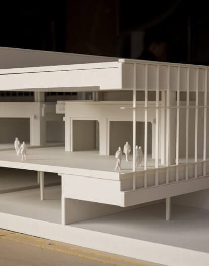
To better understand the design intent for the navigation process, we conducted a flow analysis of the plans offsite. This gave us insight into how users should ideally navigate decision points as they enter and travel through the airport and helped us to identify patterns and trends in flow, bottlenecks, and passenger touchpoints. We learned that the intended design itself is intuitive and has a natural flow for both departing and arriving passengers. However, a spatial analysis showed that just because two areas are adjacent in the plan view does not mean the visibility between the two is optimal. We found that the best visibility is not where key decision points are occurring—in some cases, the best visibility was in a circulation space that does not allow for pausing and making those decisions.
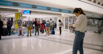
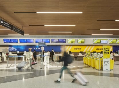
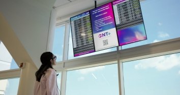
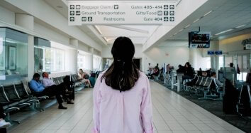
Further, when an arriving passenger exits the terminal, visibility is limited as they continue down the escalator towards baggage claim. There is no clear visual connection to the baggage claim carousels or even location-specific signage as you exit and are selecting which way you need to go. It isn't until passengers are right in front of the baggage claim that they have direct visibility. Even then, carousel assignments are only visible on screens on the back wall, while larger screens on the carousels themselves only showed a collection of ads and no baggage claim information. Passengers often wait for the ad signage to rotate to carousel assignments. For current and future terminals, it's important to provide a clear and sequential hierarchy of information to reduce confusion and to make sure that at key touchpoints, passengers have the correct information to make decisions.
Seeing the signs
Another area where we saw some pain points was security. Our social media scan revealed that a lot of stress happens in this area. Our first instinct was, “Of course—it's security. There are bound to be a lot of complaints here.” But, when we went onsite, we understood the nuances that are causing stress.
One issue is that ONT has a split-level security operation where passengers check their tickets on the lower level before going up the escalators to enter the security line. This heightens anxiety for passengers on the lower level who are unable to gauge the length of the line at the top. Passengers are fumbling with their phones after having just shown their tickets to TSA agents, causing them to lose their balance and fall off the escalators. The escalators are also extremely difficult to navigate for passengers with reduced mobility—who often don’t realize an elevator is an option - and suffer vertigo when they use the escalators. We thought it was a coincidence that we were at the airport collecting data when the falls happened, but staff confirmed that they are a regular occurrence. Solutions to this issue could include vertical vegetation, which research tells us can reduce vertigo and help stabilize passengers going up the escalators. Adding acoustical baffling to reduce sound levels—which exceed 80Db for 96% of the day—could also help reduce a vertigo trigger.

The escalator traffic also runs into trouble when they arrive on the second level: as passengers reach the top of the escalators, they must decide to go left to TSA pre-check or right to the standard security line. Comments on social media revealed that the pre-check signage is not prominent enough. Making the pre-check and regular security signage more prominent at the top and bottom of the escalators would allow passengers to plan their next step more easily. Adding wait times to the signs could help alleviate the “am I going to miss my flight” anxiety. The upper level also has a flow issue: passengers who used the elevators must cross the traffic coming up the escalators as well as arrival traffic exiting the terminal. A long-term programming solution would be to move the elevators to the other side of the escalators, so they have easier access to the TSA area and more visibility to passengers on the lower level.
Roadmap for design
The last phase of our research was using our insights to provide a roadmap for ONT for future designs and development, all with the purpose of increasing customer satisfaction and improving the user experience.
In developing a journey map, one of the first things we do is use the information collected from the demographic surveys, passenger interviews, and other sources to help us build profiles of ONT’s typical users. We layered the insights from our data collection across all these user profiles at each touchpoint to start building a roadmap and prioritizing improvement projects. From there we created a passenger journey map, both as a visual that the customer experience team can have as a reference and as an active reference to the research and prioritization of goals that we focused on throughout the project.

For each touchpoint, we identified what the space is, what purpose it serves, how the “key users” move through the space, and what their experience and feelings are. We also identified the goal and necessary touch points of each space, documented user perception and actions taken, and logged any pain points they experienced. We also considered how the space should ideally function, and where integration of new technology could be a solution.
Using this, we developed the design strategy for what ONT can do now to increase user satisfaction for both passengers and service providers, what can be done next with more investment to provide for better performance, and what we should be considering for future development to increase the user experience. By identifying pain points, areas of success, and opportunities for improvement, we can help our clients make informed decisions, prioritize investments, optimize services, and ultimately enhance customer satisfaction. This holistic approach deepens our understanding of passengers’ needs, fostering innovation in service and infrastructure improvements to deliver a world-class airport experience.
Experiential Optimization Service
Hugo’s journey mapping service can be used to understand and strategize for user experience not only in aviation, but our other sector areas as well.
If you are interested in deploying this service or learning more, please contact Samantha.Flores [at] corgan.com (Samantha[dot]Flores[at]corgan[dot]com) or Melissa.Hoelting [at] corgan.com (Melissa[dot]Hoelting[at]corgan[dot]com) on the Hugo team.