Emerging Themes from NeoCon and Design Days 2026
NeoCon and Design Days always put on a show, bringing the best of interior design innovation to Chicago. Across dozens of showrooms at the Merchandise Mart and Fulton Market, three themes surfaced: an embrace of color palettes that are warm, immersive, and emotionally resonant; a return to 1970s-influenced forms and retro-futurist references; and a celebration of natural materials, expressed through tactility, visible craft, and attention to detail. Corgan’s Chicago Workplace studio, led by Emily Frazer-Smith, reflects on the trends that stood out to them in 2026:
The year of color
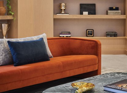
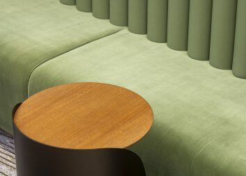
Color is always defining presence at NeoCon, but this year it arrived with depth and compositional sophistication. Last year’s color story embraced bright, saturated hues: cherry red, mustard yellow, and ultraviolet among them. This year offered a continuation of that momentum, reframed through a more layered and immersive lens. Rather than singular moments of intensity, brands explored bold color through tonal application and gradients, using variations of the same hue across furniture, drapery, wall coverings, and even ceiling treatments.
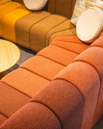
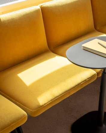
Burgundy — or maroon, or wine, or red violet, depending on your box of crayons — emerged as a resonant anchor across showrooms where it was joined by peach, vibrant oranges, soft blues, aubergines, and softened yellows that together recalled the atmospheric gradations of sunrise and sunset. The effect was enveloping: a chromatic strategy built on depth, repetition, and material nuance. Tone-on-tone compositions created a sense of continuity and visual richness, allowing color to function as an organizing principle rather than an accent.
These showrooms demonstrated how color can shape an experience through accumulation, with layered textures and coordinated finishes producing spaces that felt immersive and inviting. This year’s color story did not abandon last year’s boldness; it refined it, moving from bright statement hues toward palettes that felt deeper, warmer, and more sophisticated in their application.
Past is prologue
Another defining current was the prominence of 1970s influence, especially as a nuanced form of retro-futurism. Curved silhouettes, deeper wood tones, chrome accents, mod florals, and sculptural lighting all contributed to this sensibility, conjuring a vision of the future as it might once have been imagined, now reconsidered through a more refined and intentional lens. References to the 1970s’ color and material palettes were filtered through clean contemporary detailing, resulting in spaces that felt nostalgic yet unmistakably current.
In several showrooms, this dialogue between past and future extended beyond formal cues into the realm of storytelling. Heritage manufacturers like Haworth, MillerKnoll, and IKONstudio framed their products within a broader design lineage, revisiting archival sketches, reintroducing legacy pieces, or spotlighting brand history as part of the showroom narrative. These displays lent a curatorial dimension to the experience, suggesting that historical reference is becoming as much a tool for differentiation as innovation.
The most successful expressions of this trend applied it thoughtfully, distilling familiar motifs (avocado green kitchens and macrame plant hangers, anyone?) into compositions that feel cultured and atmospheric while remaining familiar and grounded. The effect was not a surface-level retro revival, but indicative of a desire to infuse workplace environments with narrative depth, formal softness, and a sense of design memory.
Celebration of the natural
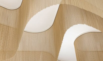
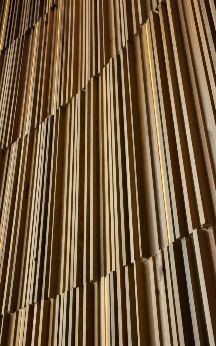
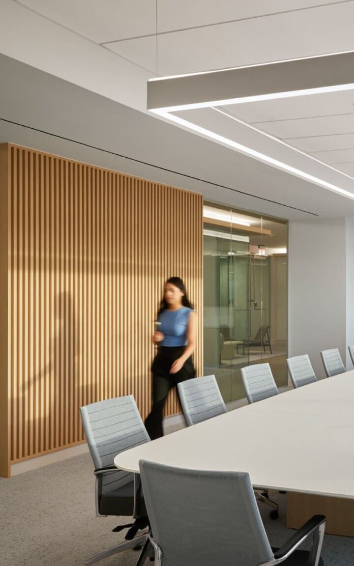
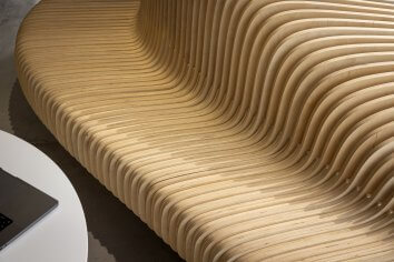
Amid the showrooms’ immersive (perhaps even bordering on bombastic) use of color and lighting, natural materials were more quietly celebrated through craftsmanship and tactility. Across categories, manufacturers emphasized surfaces and details that revealed process, texture, and construction: wood joinery, solid wood tables, stone-like plaster finishes, paper-based acoustic materials, woven fibers, and carved forms that invite closer inspection.
These choices signal a continued preference for materials that do more than perform visually. Attention to small details — like the curved base of a wooden conference table — transforms functional components into both appealing aesthetic gestures and a more satisfying tactile experience. From tambour panel workstations to the exposed wooden structure of an armchair, this craftsmanship echoed a broader industry shift toward specifying pieces that feel considered at every level, where utility and material elegance are fully integrated. Textiles too, were incorporated as a celebration of craft and process, with natural fibers and yarns shining through the finished product.
These materials were often presented within curated, color-saturated environments, demonstrating that aesthetic innovation and authenticity are not competing values, but complementary. The future of workplace design lies in this balance: spaces that are visually immersive, but materially grounded; expressive, yet attuned to the tactile value of the objects within them.